Part 2: Polynomial Regression
We discussed in the previous section how Linear Regression can be used to estimate a relationship between certain variables (also known as predictors, regressors, or independent variables) and some target (also known as response, regressed/ant, or dependent variables). We used the Boston house price dataset and eventually got an accuracy of ~74%. We also discussed how we to add more variables by creating new features. In this article we'll go over exactly how to do that.
Imports and loading data
Everything here should look familiar, if not check out the article on Linear Regression. Sklearn, Numpy, Matplotlib and Pandas are going to be your bread and butter throughout machine learning.
from sklearn.linear_model import LinearRegression
from sklearn.metrics import r2_score
import numpy as np
import matplotlib.pyplot as plt
%matplotlib inline
import pandas as pd
from sklearn.datasets import load_boston
boston_data = load_boston()

data = pd.DataFrame(data=boston_data["data"], columns=boston_data["feature_names"])
Y = pd.DataFrame(boston_data["target"], columns=["Price in $1000s"])
Polynomial Regression, 1 variable with 2 degrees
For a change, let's use a different variable: LSTAT (% lower status of the population). First we'll perform a simple linear regression to see how LSTAT fares in predicting the mean house value. Then, we can manually compute its squared value and assign it to a new column in the DataFrame called LSTAT2, and use that for the polynomial regression (in essence the same as a multiple regression).
Linear Regression with LSTAT
# Remember that for 1 variable we have to reshape it
X = data["LSTAT"].values.reshape((-1,1))

baseline_model = LinearRegression()
baseline_model.fit(X,Y)

print("The model explains {:.2f}% of the average price.".format(baseline_model.score(X,Y)*100))
Much better than number of rooms!
Polynomial Regression
Polynomial Regression with sklearn is a little more involved. For now we'll make the squared LSTAT manually:
# store the squared values in a new column in the DataFrame
data["LSTAT2"] = data['LSTAT'] ** 2
# Now as X we will pick these two variables
X = data[["LSTAT", "LSTAT2"]]
# Let's take a look at X
X.head()
# Everything here should also look familiar
polynomial_model = LinearRegression()
polynomial_model.fit(X,Y)

print("The model explains {:.2f}% of the average price.".format(polynomial_model.score(X,Y)*100))
An absolute improvement of 10%. Not bad for a couple extra lines of code!
Visualizing the polynomial model
Calculating the predictions
We will again use linearly spaced data
a = polynomial_model.coef_
b = polynomial_model.intercept_

# note that coef is an array of values, not just 1 value
a
plt.figure(figsize=(10,7))

# We do not need to plot against LSTAT2, just LSTAT
plt.scatter(data["LSTAT"],Y, label="Data points")

# Now we have 2 variables, and the second
# is the squared version of the first
linearly_spaced_data_X1 = np.linspace(0, 35, 100)
linearly_spaced_data_X2 = linearly_spaced_data_X1 ** 2

# The @ symbol performs matrix multiplication
# it is a shortcut for multiplying each
# coefficient with the respective X column (variable)
linearly_spaced_data_Y = a @ (linearly_spaced_data_X1, linearly_spaced_data_X2) + b

plt.plot(linearly_spaced_data_X1, linearly_spaced_data_Y.reshape((-1,)),
         color='red', lw=3, label="Polynomial Regression model")

# Some plotting parameters to make the plot look nicer
plt.xlabel("LSTAT")
plt.ylabel("Average House Price")
plt.legend();
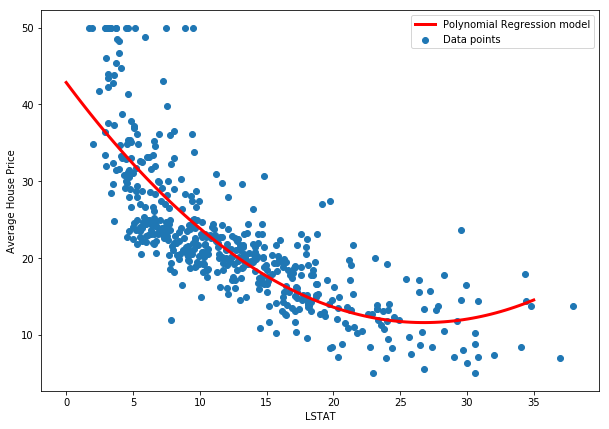
We can see that this model seems to capture the true relationship much more accurately. Now let's try with all the variables.
Polynomial Regression, all variables, degree-2 polynomials
Here we'll also demonstrate how to use sklearn's Polynomial Features.
from sklearn.preprocessing import PolynomialFeatures
features = PolynomialFeatures(degree=2)
For creating features we create a PolynomialFeatures instance, specify a degree, and instead of fitting, we fit_transform (don't let the name confuse you, it doesn't actually do any sort of fitting). We save the results as our new X:
X = features.fit_transform(data)
X.shape
X.shape shows us that we have the same number of samples, 506, but now have 136 columns instead of 2*13=26! So what happened? PolynomialFeatures creates more than just the squares. It also creates interaction terms. For example, let's say we had two features, X and Z. PolynomialFeatures creates X² and Z² but it also creates 1 (this is for the intercept) and X*Z, and it also returns X and Z themselves. From the documentation:
if an input sample is two dimensional and of the form [a, b], the degree-2 polynomial features are [1, a, b, a^2, ab, b^2].
These interaction terms usually increase model performance significantly (even if they don't have any relationship with Y, in which case they will just be dropped by the model by getting low coefficients). Let's create a new model and fit it:
# Everything here should also look familiar
full_polynomial_model = LinearRegression()
full_polynomial_model.fit(X,Y)

print("The model explains {:.2f}% of the average price.".format(full_polynomial_model.score(X,Y)*100))
A whopping increase in performance!
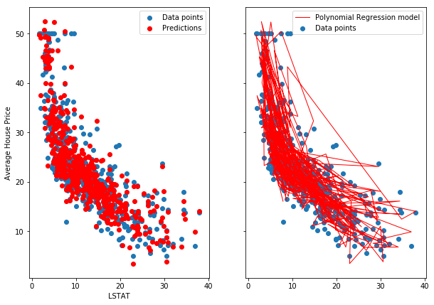
Visualization
We cannot clearly visualize this model. Here is a scatterplot and a regular line plot of the data:
a = full_polynomial_model.coef_
b = full_polynomial_model.intercept_

predictions = a @ X.T + b
fig, (ax0, ax1) = plt.subplots(1,2, figsize=(10,7), sharex=True, sharey=True)

# We do not need to plot against LSTAT2, just LSTAT
ax0.scatter(data["LSTAT"], Y, label="Data points")
ax1.scatter(data["LSTAT"], Y, label="Data points")

ax0.scatter(data["LSTAT"], predictions.reshape((506,)),
         color='red', lw=1, label="Predictions")

ax1.plot(data["LSTAT"], predictions.reshape((506,)),
         color='red', lw=1, label="Polynomial Regression model")


# Some plotting parameters to make the plot look nicer
ax0.set_xlabel("LSTAT")
ax0.set_ylabel("Average House Price")
ax0.legend();
ax1.legend();
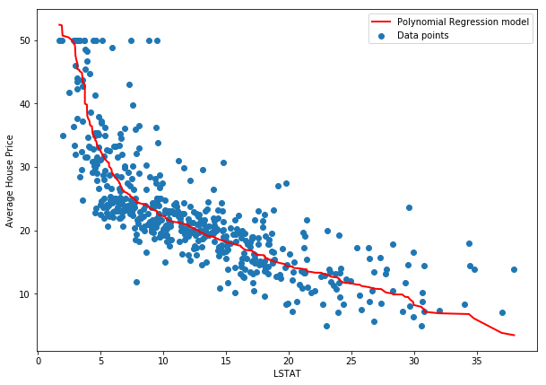
And here is the incorrect approach. A correct approach would need some X-wise averaging, as suggested in the SO answer.
plt.figure(figsize=(10,7))

# We do not need to plot against LSTAT2, just LSTAT
plt.scatter(data["LSTAT"], Y, label="Data points")

# This is INCORRECT because it losses the real
# mapping from data to prediction,a but I believe
# it gives us a better picture of the model
plt.plot(sorted(data["LSTAT"]), sorted(predictions.reshape((506,)), reverse=True),
         color='red', lw=2, label="Polynomial Regression model")

# Some plotting parameters to make the plot look nicer
plt.xlabel("LSTAT")
plt.ylabel("Average House Price")
plt.legend();
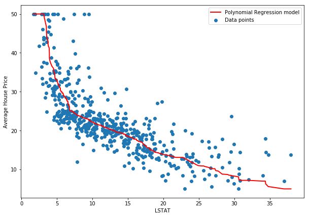
How many degrees?
It's easy to see that as we increase to polynomials of higher order (x³,x⁴, etc), the accuracy of our predictions rise. In fact, using 3rd degree polynomial features gets us to an R² of 1, or 100%. This is what we call overfitting. The model doesn't find the relationship in the data, but instead "memorizes" the mapping from X to Y. This defeats the purpose because given a new data point, the model will almost certainly predict it wrong.
When modeling we usually split the data in two or three sets (training and testing, or training, validation, and testing). We train on one, evaluate on the other, and if we have a third we keep it till much later only for final evaluation purposes. We'll cover these in other articles. For now, let's see how the 3-degree polynomial regression does:
features = PolynomialFeatures(degree=3)
X = features.fit_transform(data)

X.shape
overfit_polynomial_model = LinearRegression()
overfit_polynomial_model.fit(X,Y)

print("The model explains {:.2f}% of the average price.".format(overfit_polynomial_model.score(X,Y)*100))
a = overfit_polynomial_model.coef_
b = overfit_polynomial_model.intercept_

predictions = a @ X.T + b

plt.figure(figsize=(10,7))

plt.scatter(data["LSTAT"], Y, label="Data points")

# again, the wrong method
plt.plot(sorted(data["LSTAT"]), sorted(predictions.reshape((506,)), reverse=True),
         color='red', lw=2, label="Polynomial Regression model")

plt.xlabel("LSTAT")
plt.ylabel("Average House Price")
plt.legend();
In this article we saw how to perform Polynomial Regression, we've demonstrated the use of sklearn's PolynomialFeatures class, and we introduced overfitting. In the next articles we will talk about stronger models, and some initial strategies for avoiding overfitting.